
The case for calm hardware
Most products we are asked to design are trying too hard. A note on restraint, why it is harder than it looks, and what it does for a brand.
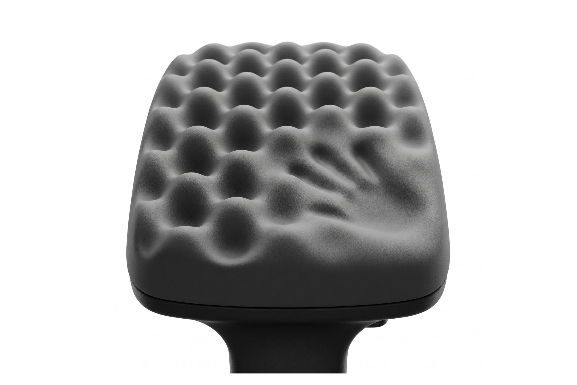
A personal safety alarm, a cargo bike and a table lamp have little in common except that, when they came to us, each brief asked for the product to stand out. In each case the better answer was the opposite: a product that stands still.
What calm means
Calm hardware is not minimal for its own sake. It is a product in which every visible element has a job, and nothing is there to signal effort. Fewer surfaces, fewer colours, fewer parts, and a form that reads at a glance.
The Kido alarm is an example. A safety device could easily look technical, with indicator lights and a hard shell. Instead it is a soft, rounded housing with one tactile button and a woven strap, in muted tones. The technical content, a custom PCB and sealed acoustic and sensor openings, is inside. The outside says reassurance.
Why it is hard
Restraint is expensive in design time, because every element that remains has to carry more. A single button has to feel perfect. A single seam has to be straight. A single colour has to be exactly right on the material it is on. You cannot hide a mediocre detail behind a busier one.
It is also hard to sell internally. A render with more features looks like more work was done. A calm product can look, to a committee, as if something is missing. The argument for it has to be made in terms the committee cares about: fewer parts, fewer finishes, fewer things to go wrong, and a product that will still look right in five years.
What it does for a brand
A calm product is recognisable because it is simple, and ownable because the simplicity is specific. The CycleOx cargo bike has an architectural frame and one highly integrated cargo volume. There is no styling to copy, only a proportion. That is a stronger position than any graphic.
Calm also ages well. Trend-led surfaces date in two years. A product reduced to its proportions and its materials does not.
How we get there
We start with more than we need and remove. Early concepts are busy, because exploration should be. Then, for each element, we ask what fails if it goes. If nothing fails, it goes. What remains is the product.
Then we spend the saved effort on the few things left: the radius, the gap, the button, the finish. That is where a calm product is won or lost.
When not to
Not every product should be quiet. A brand activation object on a bar has to be seen across a room. A children's product can be joyful. The question is not whether to be calm but whether the energy in the design is doing a job. If it is, keep it. If it is decorating, take it out.